What the tool does, why it does it that way, and where every control lives.
Written for marine professionals who already hold their own subscriptions to
sold-sales data.
Reading as
The two modes reach the same concluded figure. What changes is
who the document addresses. Switching here reveals the notes written for that mode.
Showing the surveyor's document — written to withstand
examination, with the replacement cost stated.Showing the broker's document — written to open a
conversation with an owner. A replacement cost can be entered, but it never appears in it.
Video tour · about 5 minutes
Watch a full valuation, start to finish
A narrated walk through the surveyor worksheet with a real example vessel:
bringing in the listing and sold comparables, catching a duplicate sale, the adjustments,
and the finished analysis, PDF, ledger and narrative.
Read this part once. Everything after it assumes you have.
This is a calculation aid. You supply comparable sales, guide figures,
condition ratings and the adjustments you choose; it does the arithmetic consistently,
shows its working, and drafts a narrative you can paste into your own document.
It does not verify your data, it does not exercise professional judgment, and
its output is not an appraisal. Every figure it produces depends entirely
on what you put in. The result, and anything built on it, remains your professional
judgment and your responsibility.
You bring the data
The tool does not have a sales database and cannot fetch one. It is built for marine
professionals who already hold their own subscriptions to sold-sales resources —
BoatWizard / SoldBoats for achieved prices, BUC for guide values. If you do not have
access to recorded sold prices, this tool has nothing to work from.
What it is actually for is consistency. The same boat, worked twice, reaches the same
answer by the same disclosed route — and every exclusion, every assumption and every
extrapolation is named in the output rather than buried in it.
BThe method it enforces
These are not preferences you can switch off. They are built into how the tool works.
The whole reason the tool exists is that these are applied the same way every time.
Open any of them for the reasoning.
No artificial intelligence in the figures, the ledger or the narrative
Every figure, adjustment, ledger line and sentence of the narrative is produced by fixed rules
applied to what you enter, so the same entries always give the same result and every step can
be rebuilt by hand. A language model can answer the same question two ways; a valuation must not.
Artificial intelligence is used in two places only. It reads the documents and listings you
supply (a sales table, a listing page, a guide report, a receipt) into the fields, for you to
check; equipment it finds on a listing arrives by name, with the dollar values left blank for
you. And it answers questions in the built-in guide, which explains and never calculates.
The finished analysis says so in its own words: the narrative closes on it, and the broker's
document carries it as its last section. It states that the opinions are solely those of the
preparer.
Sold prices are the primary basis
What a buyer actually paid is the evidence. Everything else in the worksheet is
context, corroboration, or a fallback for when recorded sales are thin.
Asking prices never enter the value at face value
An asking price is a hope, not a transaction. Listings appear in the document as
market context. They can become a working basis — but only after an
expected-sale deduction, and that deduction is measured from your own
comparables wherever they carry both an asking and an achieved price.
Broker
This is the path you will use most when you are working before anyone has been
aboard and there are no sold comparables yet. It is a supported route, not a
compromise — but the document always says what measured the deduction.
Comparables are normalized for age at the date of sale
Not by model year alone. A 2021 boat that sold in 2021 was nearly new when it changed
hands; the same boat selling in 2025 was four years old. Those are different pieces of
evidence and the tool treats them so — which is why a sale date is worth chasing
down even when it is inconvenient.
Adjustments stack additively and never compound
A 10% and a 5% adjustment make 15%, not 15.5%. This is deliberate and it is
not configurable. Compounding produces figures nobody can recompute by hand, and a
figure your reader cannot check is a figure they can dismiss.
Two steps sit outside that rule by design, and the finished document says so. A
market-conditions figure, for changes in the market since the sale, is applied to the
sale price first, which is the order the sales comparison approach prescribes. The age
normalization then restates that price as if the boat had sold at the subject's age.
Only after those two steps are the condition, equipment and region adjustments added
together and applied once. Nothing is compounded year on year.
Guide data is reference only, unless you deliberately rely on it
Published guide figures are never quietly averaged into the answer. They sit alongside
it as corroboration. If you want them to carry weight you say so, explicitly, using
Blend sources under Value Basis in Section 6 — and the document records that you did.
Excluded comparables are still disclosed, by name, with the reason
You can exclude any sale. What you cannot do is make it disappear. An excluded
comparable is named in the finished document along with why it was set aside.
Silently dropping inconvenient evidence is the exact thing this tool exists to
prevent. If a sale is genuinely not comparable, saying so in the open is stronger
than hoping nobody asks.
Nothing unverified reaches the narrative
A figure that cannot be substantiated is omitted, never hedged. The narrative gets
pasted into signed documents, and a hedge in a signed document is worse than a
silence — it invites the question it was trying to dodge.
CThe two modes
One calculation engine. Two documents, for two very different readers.
What never changes
The concluded figure is identical in both modes. So is the primacy of
sold comparables, and the rule that asking prices never enter the value at face value.
If switching mode appears to move the number, it has not — something else changed.
Mode changes who is being addressed, not the arithmetic.
Surveyor
A document that must withstand examination. Its reader is a bank, an
insurer, a court, or a client's advisor — someone who was not present and is
looking for reasons to doubt it.
So it justifies its method at length: the full narrative, every step from basis to
conclusion, every excluded comparable named with its reason. It states a point figure,
and states the replacement cost where one is entered.
Broker
A document that opens a conversation with an owner. Its reader is the
seller, or a prospect deciding who to list with. It is not defending a figure to an
examiner, so it does not justify its method in the same detail — it uses the concise
narrative and leans on comparative graphics, so a reader can see the subject
against the comparables rather than read an argument about them.
Its real job is often to help an owner's expectation meet the market. A replacement cost
never appears in it: an owner told what a new one costs tends to measure a used boat
against that figure rather than against the sales.
You choose a mode on the screen that appears before the terms, where Surveyor and Broker
are offered, on your first visit to the worksheet. It is kept with your account after that,
so you are not asked again, on this computer or any other. To change it later, use the Preparing as switch in the vessel
header at the top of the worksheet, marked Marine Surveyor / Yacht Broker: beside the
vessel’s name on a computer, under it on a phone. You can switch at any point. Everything you have entered comes with you: the vessel, every comparable and
listing, the guide figures, your adjustments and your answers. Press Calculate
afterward to see the analysis written for the other mode; the figure will be the same.
The one thing that may not come across is a photograph. If the photographs are too large
for the browser to hold while the page reloads, the switch tells you before it happens and
everything else still comes with you. In the rare case the browser cannot hold a copy at
all, it warns you first that the worksheet will be cleared, and you can cancel.
The sections are numbered the same in both modes. The small gold label above the
vessel’s name tells you which mode you are in: Marine Surveyor’s
Valuation or Broker’s Market Analysis.
Broker
Your evidence will often be thinner, and the tool bends rather than breaks.
Where a surveyor's document would refuse and state why, yours states a range and says
what measured it. That is by design.
DSigning in and My valuations
Where you start, where your work is kept, and how it is saved.
The worksheet needs you to be signed in. Open it signed out and you are
taken to My valuations to sign in, and then straight back to the worksheet you were
opening.
The opening terms are accepted once for your account. On your first visit to
the worksheet, you choose your mode and then accept the terms. After that neither is shown
again, on this computer or any other you sign in on, until the wording of the terms changes;
then everyone is asked to accept the new wording, and only the terms are shown. On a computer
you have not used before, the worksheet checks with your account for a moment before it opens,
and if your account cannot be reached the terms are shown, so you can accept them and carry
on.
Reading listings and files, Val, Save as PDF and Send to my phone need the sign-in
too, and the server checks it each time. If your sign-in has ended, the worksheet says
“Please sign in to use this.” at the top of the form, with a Sign in
button that keeps your worksheet on the screen. If an account is suspended, the worksheet and My
valuations say so in the same place: those features are turned off and new work is not saved,
while the valuations already saved can still be opened and downloaded. Use Leave a
comment on My valuations to ask about it.
Sign in, at the top of the site’s home, guide and privacy pages, opens
the sign-in window right there, and once you are signed in takes you to
My valuations. Create account, beside Sign in on the home
page and on My valuations, opens the same window on its sign-up tab. If you are already
signed in, the button reads My valuations and takes you straight there. My valuations is the
page you start from: every valuation you have made is a card on it. If your sign-in ends while
a worksheet is open (you signed out in another tab, say), the worksheet’s own Sign in in
the upper right (below) signs you in again where you are, and keeps you on the worksheet you
are working on.
Start a new valuation — the large button at the top. It opens an
empty worksheet. The card appears on My valuations as soon as you give the subject
vessel a model year, make or model.
Open a file — beside it. Choose a worksheet file saved from this
tool and it is added to your account as a new card, ready to open. A file that is not a
worksheet from this tool is refused, and nothing is added.
Continue — when you have a draft, the most recent one is offered
here by name, so you can pick up where you stopped.
Each card shows the vessel, its location and effective date, the mode it was prepared in,
the concluded value (or Draft while it has none), when it was last saved and, for
larger ones, how much storage it uses. A search box and filters narrow the cards to drafts, completed
valuations, or one mode. Press Open to carry on working in the worksheet; a
card prepared in the other mode switches the worksheet to that mode as it opens. While the
card comes back, the worksheet shows Opening and the valuation’s name
in place of the form, with how far it has got (the photographs are counted as they arrive),
and shows the whole worksheet at once when every section is back, exactly as it was saved,
reviews kept as is included. If that takes much longer than it should, it says so and offers
Try again and My valuations. Clicking
anywhere else on a card does not open it: it points at Open, which pulses, so a stray click
never takes you away from your cards. The
card’s menu holds the rest:
Copy — a duplicate card, so the original stays exactly as it
was. The copy shares the original’s photographs rather than storing them
twice.
Download file — the worksheet as a file in your downloads, the
same file the worksheet’s Save to file makes. Open a file brings it back.
Download HTML and Save as PDF — the finished
document, without opening the worksheet. Both need a valuation that has been
calculated; a draft has no document yet. If the PDF cannot be built, the document opens
in its own tab for you to print instead.
Rename — give the card a name of your own. A card is named for
its vessel until you do, and keeps your name through every later save.
Delete — removes the card, its document, and any photograph no
other valuation of yours uses. It asks first, and cannot be undone.
Deleting several at once. Press Select, beside the sort
menu, and a checkbox appears on every card. Tick the ones you want, or click anywhere on a
card to tick it. Select all ticks every valuation the current filter and
search are showing, and says how many (“Select all 37”), so filter to Drafts
first to clear out old drafts only. A bar at the foot of the screen keeps the count in view,
with Delete selected and Cancel; Escape also leaves Select.
Delete selected asks first, naming how many and listing each one, and says so when any of
them has been tipped on. For 20 or more, or for every valuation on your account, type
DELETE to confirm. The whole selection goes in one step and cannot be undone. If any could
not be deleted, the page says which and leaves them ticked so you can try again.
The page also links to the worksheet, this guide and the main site, and takes a comment. A
tip is left from the card it thanks, not from the side of the page.
Quick references are four small calculators, plain arithmetic for reference
only. None of them ever enters a valuation:
Average — the average of a set of figures, with how many there are
and the low and the high. Type one figure per box (Add figure adds a
box, the × beside a box removes it), or paste a list into any box with commas,
spaces or new lines between the figures. It needs at least two.
List-to-sold — the percent change from an asking price to a sold
price, and the dollar difference. Market context only: asking prices never enter the
value at face value.
Percent — a figure plus or minus a percentage of itself. The
+ button switches to − and back. It shows the
result and the amount added or subtracted.
Depreciation — straight-line, never compounded: enter a figure and
a rate per year, then move the slider, one step per year, up to 15 years each way. Right
depreciates, left appreciates, and the line above it reads, for example, “7 years
· depreciated 35%”. A figure depreciated by 100% or more stops at $0, and
says so.
The calculator you last used opens first next time on the same browser.
Tips, valuation by valuation
Tipping is optional, and each tip belongs to one valuation. A card that has been calculated
shows where it stands:
Thank you for your tip — once a tip for that valuation has been
paid, its card becomes a golden ticket: engraved gold, a double printed border, a tear line
with a notch at each edge and a star seal beside the menu, with the thank-you on a navy
ribbon across it. Point at the card and a band of light crosses it and the seal turns once
(on a phone, once when the card first comes into view; with reduced motion, nothing moves).
Rest the pointer on the ribbon to see the date, and how many tips there have been if more
than one.
No tip yet — with a frowning face, on a calculated valuation nobody
has tipped for, and beside it a Leave a tip button. It opens the tip page
in a new tab, linked to that valuation, so the card can thank you once the payment is
confirmed. That usually takes a few moments; if you come back from the payment to
My valuations, the page checks again by itself.
Coming back from the payment, My valuations opens on a full-screen Thank you!
and, once the payment is confirmed, says Confirmed. with the name of the card
that is now gold. See your gold card takes you to it and lights it up as it
turns gold; so does closing the thank-you with You’re welcome, its
×, Escape or a click outside it. It closes by itself after a few
seconds, and waits while the pointer or the keyboard is on it.
A draft that has never been calculated shows neither. A copy is a new valuation, so it
starts untipped. In the worksheet, Leave a tip sits beside Feedback just below the Calculate
bar. It is linked to the valuation you have open, and a valuation that has been tipped for
does not ask again.
Saved as you work
While you are signed in, the worksheet saves itself. Drafts are saved too:
saving begins as soon as the subject vessel has a model year, make or model, and every
change after that is saved a few seconds after you stop typing. Pressing
Calculate or Recalculate saves the worksheet and, once the
result is up to date, the finished document beside it, which is what the card’s
Download HTML and Save as PDF give you. Reset section clears part of the
valuation you have open, so it saves to the same card; a new valuation, from
Start a new valuation on My valuations, gets a card of its own.
Reloading the page brings back the valuation you had open, from its card,
with the same Opening panel while it does;
if the reload came while a change was still being saved, the page opens blank instead and
says the valuation is saved in My valuations, with Open it again beside
it.
When Fairlead Value is updated while you have a worksheet open, a small notice
appears just above the Calculate bar: “Fairlead Value has been updated.” It also says
whether your work is saved, and says “Your work is saved” only while that is true.
Reload saves anything not yet saved first, then reopens the same valuation at
the section you were in; if the save fails, the page stays where it is and says so.
Later puts the notice away until the next update. The page you have open keeps
running the version it loaded until it is reloaded, so reload when it suits you.
The bar at the top of the worksheet says where things stand, and a small pill at the bottom
left, just above the Calculate bar, speaks up only when something needs you: a save that has
failed, or a save the page is waiting for before it takes you to My valuations or signs you
out. Otherwise the pill stays out of the way, so it never sits over a field you are
typing in.
Saving… — a save is on its way.
Saved — with the time, once your account holds the latest
change.
Not saved — with the reason, in the bar and in the pill. Press
Retry to try again, or Save to file to keep a copy on
your own computer while the problem lasts.
The pill is never part of the document and does not print.
At the top of the worksheet
A dark bar runs across the top of the worksheet, the same bar My valuations carries. At its
left is the Fairlead Value mark and, where the tool is offered through a partner, the
partner’s logo, which takes you to the partner’s own site. Signed in, the bar
also repeats the save pill’s word (Saving…, Saved with the time, or Not saved)
so you can see it at the top of the page; where the bar is short of room, on a phone or beside
a partner’s logo, it shows only the pill’s colored dot. The worksheet’s upper right holds the way
back to your cards, the site’s other pages, and your account:
My valuations — takes you to your cards. Signed in, it waits for
your latest change to be saved, then goes; signed out, it opens in a new tab, so the
worksheet stays where it is. On a phone it shows as a small grid of four squares.
Main site and Privacy — the site’s home page
and the page that says what the tool records, each in a new tab so the worksheet stays
where it is. On a phone they move into the account menu.
The light and dark switch, the moon or sun button. The worksheet, My
valuations and this guide share the choice. The analysis document itself stays white
in both, because it is shown as it will be printed.
Signed in, your account: a round badge with your initials and the part of your email
address before the @, which you press
for a small menu. It shows the email address you are signed in with, then
My valuations, User guide (this guide, in a new tab)
and Sign out. Signing out waits for the latest change to be saved
first, then takes you to the My valuations sign-in page.
Signed out, Sign in stands there instead. It signs you in where you are,
and the worksheet starts saving to your account.
Under the bar sits the vessel header. Its small label says which document
you are preparing, and once Section 1 has a year, make or model, the vessel’s name
appears beneath it in large type, kept up to date as you type. A line under the name gives
the location, the effective date and the asking price, which a surveyor’s worksheet
marks Reference only (a broker’s shows the list price there). A
Draft tag sits beside the label until the worksheet has a current calculation,
and comes back when an entry changes after one.
Under the name, the Method line says, in one line, what this worksheet’s
last calculation rested on: how many sold comparables it retained (and how many were
excluded), whether they were blended with guide data or listings and at what weights, the
expected-sale deduction where listings stood in for sales, the curve fitted to replacement
cost where that was the depreciation scale, and how far Section 6 moved the figure, for
example 6 sold comps blended with guide data 50/50, with a 15% upward adjustment. It
is read from the calculation, never worked out separately. Before the first calculation it
reads Not yet calculated; once an entry changes it grays and ends
as of the last calculation. Point at it, click it or press Enter on it and a
note opens over the page, How this figure was reached: the line in full, the
sales retained and each one excluded with its reason, the depreciation scale, Section 6’s
parts, the rounding, and for a broker’s range what its width measured, with
See how the figure is built to go to the build-up; Escape or a press elsewhere
closes it. On a phone it waits for a wider screen, so the header stays short.
The Preparing as switch is beside the header on a computer and under it on a
phone. The small (i) beside its label explains the two modes when you point
at it, click or tap it, or reach it with the keyboard and press Enter: switch at any time,
everything you have entered comes with you, the concluded figure does not change, and a
broker’s analysis applies the same methodology but is not an appraisal, and says so.
Escape, a second press, or a press anywhere else closes it.
Under the vessel header sit four summary tiles, each a link to the part of
the worksheet it sums up:
Sold comparables — how many sales have a sold price, with how many
are retained and how many excluded. It takes you to Section 2.
On-market listings — how many listings have an asking price. It
takes you to Section 3.
List-to-sold spread — the average gap between asking and sold
prices, and how many retained sales recorded both. It appears only when the last
calculation measured a spread, and shows that calculation’s figure, never a new
one.
The figure — the concluded figure, in the same state as the figure on top of the
steps (see The figure on top). Before the first calculation it
reads Not yet calculated and takes you to the Calculate button instead. On a wide screen,
where the figure already heads the rail beside it, this tile is left out rather than
saying it twice.
On a phone the tiles are not shown, so the first field is not pushed down; the strip at the
top carries the figure there.
On a phone or a tablet, the steps and the figure sit in a slim
step strip across the top of the screen: a dot for each step, ticked,
flagged or dashed as the rail on a wide screen shows them, and the figure at the right end,
with a small dot that is green when the figure is up to date and brass when the inputs have
changed since. Tap a dot to go to its step, or the figure to go to the conclusion. A section
you reach from the strip lands below it, never under it. A screen reader hears each dot by
its section’s full name. On a phone turned on its side the strip and the Calculate bar
slim down, so they take less of the short screen.
Nothing floats over the fields. The Calculate bar holds Ask Val; Leave a tip
and Feedback sit in the page just below the Calculate bar; the save pill appears only when a
save needs you, and then above the bar. When you tap into a field that the strip, the bar or
the sales’ stuck column headings would cover, including when a phone’s keyboard
opens, the page scrolls just enough to bring the field into the clear; with the keyboard, it
does the same for anything Tab reaches. A button you click is left where it is, so the click
always lands. On a phone the sales’ sort buttons stay on one line
and scroll sideways.
Each section
Every numbered section is a card in its own color, the color running down its left edge,
behind its heading and in its number, and under its step in the menu at the left (or in the
strip at the top on a phone), so you can tell where you are at a glance. Each of the six has
a color of its own: teal, amber, blue, magenta, green and orange, in order.
A new valuation opens with every section folded to its heading bar, so
the six steps fit on one screen: click a heading, or the arrow on its lower edge, to open
the section you want. To have every section open instead, untick Open with every
section collapsed in Settings, under your account menu.
Fold a section away. Click a section’s heading (anywhere but its
buttons) and the whole section folds down to its heading bar, showing only its number,
title and the same one-line summary as its step (for example “6 sales · 5
retained”), with a quieter Reset section; click it again to open it.
The small arrow on the card’s lower edge does the same, and is the control a keyboard
or a screen reader uses. Nothing in a folded section is lost: it is still saved and still
calculated. The worksheet remembers which sections you folded until you close the browser
tab, and a section opens by itself when you go to it from the steps, a tile or a link, drop
a file on it, or when the page takes you to one of its fields.
Reset section, at the right of each heading (Reset on a phone),
clears that section alone back to how a new worksheet starts it, including what is not a
field you can see: the subject's photograph and listing date in Section 1, the listing
addresses in Section 3, the guide's range point and combine choice in Section 4. Because the worksheet
saves as you go, it asks first, and you choose Keep it or
Reset section; Escape keeps it too. Your saved settings stay as they are,
no other section changes, a figure already calculated shows as out of date until you
recalculate, and the change saves to the same card. In Section 6 the inspection returns to
the default for your mode. Paste stays inside Sections 1 to 4, in each drop box, and in
Section 3 beside the listing addresses too. Section 5 has no drop box and no Paste: type or
paste its figure straight into the field.
The Worksheet strip under Preparing as is for when you are signed out,
which, now that the worksheet needs a sign-in, is rare: a worksheet whose sign-in ended while
it was open, or a copy of the tool that has no accounts. It holds the file buttons
Save to file and Open file, which keep a worksheet on your
own computer instead. Signed in, the strip is not shown, except to carry a message, such as
the figure a worksheet you have just opened recalculated to; the file buttons are on
My valuations, as Download file and Open a file.
Storage
Each account holds up to 1 GB and up to 200 valuations. Photographs are
what take the room, so each one is stored once and shared by every valuation and copy that
uses it. The Storage tile on My valuations shows how much of the 1 GB you are using and how
many valuations you have saved against the limit, for example “37 of 200
valuations”; its bar turns amber from 90% and red at the limit, where a new valuation
cannot be saved until you delete some (Select deletes several at once). A copy that would go past the
limit is not made. A photograph that would go past it is not stored, and then the worksheet
it is in is not saved at all: the pill shows Not saved with the reason, and every later
change to that worksheet stays unsaved until you remove the photograph or make room. Nothing
already saved is touched. Deleting valuations you have finished with makes room, and Save
to file keeps a copy on your own computer meanwhile.
EGetting data in
The single most useful habit in the tool. Learn this before the field list.
Almost every data section has a drop target, and Sections 1 and 3 also accept a listing
address. Drag a file onto it, paste an image or copied text, or, in those two sections,
give it a link, and the tool reads the specification out for you.
Drop or paste sold comparables hereOptional
A SoldBoats screenshot, a spreadsheet or a copied table — each sale becomes an editable row you can check and adjust.
Paste
Illustration — the drop target, as Section 2 shows it. Sections 1, 3 and 4 each have their own
Section 1, Subject Vessel — paste a listing address or the listing
text itself, or drop a PDF, a Word file, a screenshot or a photo, and let it read the
specification. Pasted text usually carries more detail than a picture.
Section 2, Sold Comparables — drop a broker sheet, a spreadsheet
export, or a screenshot of a results table. Several sales can arrive in one pass.
Section 3, On-Market Listings — paste several listing addresses at
once. They land in a list at the top of the section, one row per address, ready to be
read together.
Section 4, Valuation Guide Reference — drop the guide page, or a
screenshot of it.
Settings — drop your logo file straight onto the logo box in the firm block.
A screenshot of a table beats retyping the table
Typing a specification out of a document you already have open is the slowest path in
the tool, and it is the one most people default to. The manual fields are always there
underneath as a fallback — but reach for them second.
Beside every drop target except the logo's sits a Paste button. Section 5 has
no drop target and so no Paste button; its one figure is typed or pasted into its field. The button exists so the tool works
without a keyboard shortcut and on a phone, where dragging a file is awkward. If dragging
is not available to you, that button is the route.
A dropped screenshot also becomes the picture
A screenshot is not only read for its figures. The vessel's photograph is cut out of it and
attached: to the subject vessel in Section 1, and to the listing rows in Section 3, one
picture per listing where the screenshot shows several cards. The page around it goes
— the filter sidebar, the specification table, the broker's contact form —
because the year, the price and the location are already in the row's own fields, and
carrying them in the picture as well only duplicates them.
The cut is the software's proposal, not a decision. Every picture it takes keeps the file it
came from within reach: press Use full screenshot and the whole image comes
back in place of the crop. That button appears only on a picture that was actually
cropped, and swapping to the full screenshot does not change whether the picture goes
into the document. Check that each
picture is the vessel you expect: a listing row's picture waits for you to tick it in
(unless you have ticked Show photographs in the report in Section 3, which the tool
remembers), and the subject vessel's is ticked for you. A neat crop of the wrong boat reads as a verified
photograph of the right one.
Where the screenshot cannot be cut into exactly one picture per listing — a page layout
the tool cannot read, or a card partly scrolled off the frame — nothing is cut and
every row carries the whole screenshot instead. The note under the drop zone says which of
the two happened, so you can tell a screenshot the tool could not split from one it never
tried to split.
1Subject Vessel
The boat being valued, its specification, and the date the value speaks to.
Year, make, model, length, beam, draft, engines, hours, fuel, hull material and
configuration, water use, and location. Also the subject's own asking price if she is
currently listed, and the effective date of the valuation. For a broker
the price field is the (Expected) List Price: the price she is listed at,
or the figure the seller has in mind.
The effective date starts as the day you begin the worksheet. Under it,
Use the calculation date is ticked on every new worksheet: each time you
press Calculate or Recalculate, the date becomes that day’s, so a valuation you finish a
week after starting it is dated the day you calculated it. Untick it, or type or pick a date
yourself (which unticks it), and the date is fixed: it stays as you set it however often you
recalculate. The line under the field says which it is. Only your own press of Calculate moves
the date; reopening a saved worksheet, switching mode or opening a shared copy never does. A
worksheet saved before this box existed, and a copy someone shared with you, open with it
unticked, keeping the date they were saved with.
These fields sit in the folded Vessel details panel below the drop
target. It opens by itself once a read or a paste has filled it; open it yourself to
review the figures or to type them in.
1Subject VesselReset section
Identify the subject vessel. Anything captured below fills the editable fields for your review; nothing reaches the analysis unreviewed.
Vessel
Model year
2009
Make
Viking
Model
52 Convertible
Location
Stuart, Florida
Valuation
Effective date of value
08/26/2026
Use the calculation date
Drives every age calculation. Set to today’s date each time you calculate.
Current asking price ($)Reference only
$ 449,000
Illustration — Section 1, with the effective date focused
The three controls people miss
These sit apart from the main fields, which is why they get overlooked.
Include image appears inside the drop target once you paste a listing
address, Propose improvements sits inside the drop target itself, and
Add a photograph of this vessel is in the folded
Vessel details panel, beside the year, make, model and location.
Include image
Ticked by default, and the tool remembers your choice for next time. Brings the
listing's photograph in along with the specification when a listing address is read.
It governs the address route only: a dropped screenshot or PDF supplies its
photograph either way, as described under Getting data in.
Include image
Propose improvements
Off by default. When you tick it, reading a listing does a second pass
and returns an itemized list of material improvements it can see, each with a rough
contributory value. Those land in the improvements list in Section 6.
They are a starting point to edit, not a finished answer. But this is by far
the fastest way to populate improvements from a broker's own equipment list, and it
works from a dropped PDF or screenshot as well as from a listing address.
Propose improvements
Add a photograph of this vessel
Attaches your own photograph of the vessel when no listing or screenshot supplied one.
The vessel has a single photograph: once a picture is attached, by any route, this
button gives way to Replace and Remove.
Include in the report decides whether it actually prints, and it is
ticked for you when a picture arrives.
Engine hours priced from engine life
Under the subject’s engine fields, Engine hours priced from engine life turns
each comparable’s Engine Hours adjustment into a worked dollar figure instead of a number you
choose. Give it three things:
Engines, how many. Filled in for you from the Engines field where it says so
(“Twin CAT C32” is two), or from the hours if you entered one figure per engine
(“2,100 / 2,140”); the line beneath says which. Type a number to say otherwise.
Expected life, chosen from your three figures: diesel, gasoline outboard, and gasoline
inboard or sterndrive (10,000, 1,000 and 3,000 hours until you change them under Additional
Settings, Engine life, which the link Change the default hours beneath
opens), or Other to enter the hours. It is set for you from the fuel
and propulsion under Vessel details until you choose; they are rules of thumb, not published figures.
New engine price, each: the manufacturer’s price for one new engine, without
installation or rigging. Where the engines are described, Search for this price opens a
web search already worded from them, and Copy search copies the words for your own; the
tool looks nothing up itself, so the figure is always the one you chose. Beneath it, say where the
price came from (the manufacturer’s published price, a dealer quotation and so on, or
Other in your own words); the ledger and the narrative name it beside the price, and so
does Section 5 when it uses this price for engines its replacement cost leaves out.
The price over the life is the cost of an engine hour. Each comparable is adjusted by the difference
between its hours and the subject’s, at that cost, for each of the subject’s engines: more
hours than the subject adjusts it up, fewer adjusts it down. Hours past the expected life count as
fully used and no more, so two vessels both past it are not adjusted for hours at all. A comparable
with a different number of engines is still a matter for the Engines adjustment; it is not
counted again here.
The ledger shows the arithmetic on every comparable’s line and states the three inputs; the
narrative says how engine hours were priced and that the figures are yours. Untick Use this
to price each comparable’s engine hours, or leave the price empty, and every Engine
Hours adjustment is entered by hand as before, with whatever you had typed brought back. A valuation
saved before this existed opens exactly as it was saved.
The same price serves Section 5. Where the replacement cost is marked as leaving the engines out (as BUC’s
does for outboards) and Section 5’s own New engine cost is empty, the engines are added at this price
for each engine, and Section 5 says so; a figure typed there is used instead. Bear in mind that this price
leaves out installation and rigging, which a new vessel’s price includes.
Once a listing has been read
Once a listing address has been read and the vessel’s details are in, the drop target
folds down to a slim strip headed Read from the listing (Read from the
page for a broker): the vessel’s photograph, the address that was read, how many
vessel details are now entered for your review and, when the read happened on this visit,
its time. The count is of details entered, by the read or by you. A worksheet opened again
from My valuations comes back with the same strip, headed Listing address
(Vessel page for a broker) instead, because a saved worksheet does not record whether
its address was read or typed. Read again reads the same address once more
without leaving the strip: while it runs the button reads Stop, a progress bar runs beneath
the strip and a status line under the box says how it is going. Replace
opens the full drop target with the address selected, ready for a different one. Paste,
Propose improvements and Include image stay in view beside the strip, and a thin Add more detail line
under it still takes screenshots, PDFs, Word files or pasted listing text, for whatever the
listing left out. A new worksheet, or one filled without an address, shows the full drop
target.
2Sold Comparables
The evidence. This section carries more weight than all the others together.
The sales sit in one compact table, a row to a sale. Each row shows the sale’s number,
the vessel’s name with its year, make and model, the sold date, the sold price with the
list price and the list-to-sold spread under it, the age at sale against the subject’s
age, the age adjustment, the Indication (the sale carried to the subject), and
a Retained switch. Click a row to edit in place: its fields
open beneath it — year, description, vessel name, location, list price, sold price, sold
date and source — and click the row again to close them. A new or empty sale opens ready
to fill; a sale with something to fix, or with your cursor in it, stays open. A closed row
still shows any warning it carries — a likely duplicate, a review banner or a missing
sold price — under its line.
Every per-comparable adjustment lives inside that sale’s own row, in the
adjustments block of its editor — not in a central table. That is the single most common
thing people hunt for and cannot find.
The age, the age adjustment and the indication come from the last calculation.
They are the figures the calculation produced, shown again on the row, never worked out a
second time. Before the first calculation they read “—”. Change an input after
calculating and they turn gray and read as of last calculation until you
calculate again; on a phone each card says so under its own indication. Removing a sale
after calculating does the same. The sold date and the prices you type show as you type
them.
Sorting. Press a column heading to sort by it, and again to reverse it. The
headings stay on screen as you scroll a long list. Sorting changes only the order on the
screen: each sale keeps its number, and the analysis document and the saved worksheet keep
the order you entered the sales in. Your browser remembers the sort you chose.
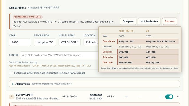
Where a sold date could be read either way round, such as 03/04/2025, the row carries a small
Read as M/D/Y tag beside it: month first, which is how the worksheet reads it.
Check it against the source if the sale might have been recorded day first.
On a phone each sale is a short card showing the name, the sold price, the indication and
the Retained switch; tap it to edit.
The sales chart
Above the table, once you have calculated, a chart draws each retained sale as a line from
what it sold for (a hollow dot) to its indication, the figure after it is
carried to the subject’s age and adjustments (a filled dot), against a vertical line at
the concluded value. A long line is a sale doing a lot of work to reach the subject; a cluster
of filled dots around the line is evidence that agrees with itself. Point at a sale on the
chart and its row is highlighted, and the other way round.
The chart shows the last calculation’s figures and nothing else. It does not appear
before the first calculation, and turns gray when inputs have changed since, until you
calculate again. It is a worksheet aid only and never appears in the analysis document. The
depreciation-scale chart further down the section is a different picture: it shows the scale
itself, with each sale marked on it.
Source sits on its own line in each sale’s editor and records where that sale
came from — SoldBoats.com, YachtWorld, a brokerage report. When you drop a screenshot
or a PDF, the read fills it in for you if the page identifies itself; where it cannot tell,
it leaves the box empty rather than guessing, and you fill it in. Apply to all
copies your entry into every comparable that is still blank, so six sales off one service
take one typing. It never overwrites a source you set deliberately on another row.
Every adjustment can carry a reason. Once an adjustment row holds a figure, a
Reason box opens under it: “no gyro stabilizer; the subject has
one”, for instance. It is optional and it never changes the figure. What you write is
printed beside that adjustment in the ledger, in a short table of reasons under the
comparables in the analysis document, and in one paragraph of the narrative, where sales
sharing the same reason are named together in one sentence. Apply to all
beside it copies the reason to every other comparable carrying the same kind of adjustment
whose reason is still blank; listings have the same box and are kept separate.
Why the tool asks for this
The published guidance on what a valuation should contain asks it to show where the
information behind the opinion of value came from, naming the services used. The source
you enter prints beside that comparable in the finished document, so a reviewer can check
an input rather than take it on trust.
It is also what makes the closing line about particulars being “as reported by the
cited sources” true.
Excluded sales stay named in the analysis, with the reason
3Marlin Rise2010 Viking 52 Convertible · Fort Lauderdale, FL, USA01/19/2025$298,000list $349,000−14.6%15 → 17−6.2%$279,524not in average
Reason: Distressed sale
Illustration — the sales table, with one sale excluded and its reasonThe nine per-comparable adjustments
Adjustment
Entered as
Notes
Regional Adjustment
Percent
By hand.
Condition Adjustment
Percent
By hand.
Equipment Adjustment
Dollars
Contributory value, not installed cost.
Freshwater / Saltwater
Percent
Direction is set automatically from the two vessels' water use, so it unlocks only when both are stated and they differ.
Gas / Diesel
Percent
Same automatic-direction rule.
Engine Hours
Percent or dollars
Direction from the hours figures. With the engine life filled in under Section 1 (Engine hours priced from engine life), the dollar figure is worked out for you and the box cannot be typed into.
Hull Material
Percent
Locks unless both hull materials are stated and differ.
Engines
Dollars
Type, brand, horsepower and number of engines, in one figure. Contributory value, not what a repower cost — the same rule as Equipment. By hand, and deliberately never computed: value does not scale with horsepower on any rule that holds across builders.
Vessel Size / Type
Percent
By hand, and deliberately never computed.
Locked adjustments are a prompt, not a fault
Several of these stay locked until both vessels' attributes are filled in. That is
the tool declining to guess a direction. Completing the attributes on both sides
turns a manual estimate into a signed, directional adjustment — which is one of
the cheapest ways to strengthen a thin file.
Choosing a depreciation scale
The control is in this section, labeled Depreciation Scale. A
surveyor starts on the fitted curve and a broker on Martin; the reasons are set out
below. Beneath it sit the annual rate, shown when Linear is chosen, and the
market-conditions entries for each sale year.
The scales exist to compare age at date of sale — how old each vessel
was at its own relevant date — so that a model-year difference and a sale-date
difference collapse into one comparison instead of being counted twice. That is
chronological age. What the American Society of Appraisers (ASA) calls effective age, the age a vessel's condition
implies, enters through the condition percentage in Section 6, not through the scale;
feeding it into the scale as well would count the same thing twice.
Depreciation scaleMartin (Recreational)
Martin Scale (Recreational) — pleasure vessels
Fitted to these sales
3.4%
average distance from these sales
−$8,975 · −1.6%
Closest fit
Martin Scale
RecreationalCommercial
18.5%
average distance from these sales
In use
Linear rate
4%a year
a flat rate on the age difference
+$17,251 · +3.2%
Select
Illustration — the depreciation scale selector and its cards, Martin in use
Linear applies a flat percentage per year of age difference. Simple,
non-compounding, and defensible line by line. Choose it when the comparables sit
close in age to the subject, or when a figure somebody can recompute by hand matters
more than curve accuracy.
Martin publishes two tables of retained value by age —
Recreational for pleasure vessels (the default) and Commercial for
commercial vessels. They are two tables of one scale, not two separate
scales: the Depreciation Scale list offers each as its own entry, and the switch
along the top of the Martin card chooses between them. Depreciation is front-loaded, which tracks the market more closely
than a flat rate — a boat loses far more in its first years than its tenth.
Choose it when age gaps are wide. Recreational is published to 35 years, Commercial
to 40. The Commercial table is the one sometimes called the “INA Scale”; it is
part of Martin, not a separate authority.
Fitted to these sales is the default for a surveyor, and is not a
published scale at all. It measures the
rate of decline from your own comparables: each achieved price is expressed as a
proportion of replacement cost new, and a curve is fitted through those proportions
against age. Choose it when you would rather the depreciation came from the evidence in
front of you than from an industry table — there is then nothing to accept on
authority, because the sales it rests on are printed in the same document.
The % good chart tells you which scale actually fits
Under the scale picker, once a Replacement Cost New is entered, a chart
appears plotting each sale at what it actually achieved as a share of
replacement cost, against its age. The curves are drawn across those points —
the one in use solid, and a Martin table dashed for comparison (the Commercial table
when Recreational is the one in use).
The gap between a dot and a line is the error that scale makes on that sale.
That is what this chart adds: the depreciation-scale chart further down marks each
comparable on the curve, so every point sits on the line because that is where it is drawn, and it
can never show you whether the scale was right. This one can.
It is drawn under Martin too, so you can see how well — or badly — the
published scale fits your own sales before deciding whether to switch.
The three cards, and what switching would cost you
The fitted card also shows replacement cost times the curve's retained value
at the subject's age: what the same curve, read at the subject's own age, says
the subject would be worth by the cost approach. Reference only; it never enters the
value.
Above the chart sit three cards, in a fixed order: the fitted curve,
the Martin Scale, and the linear rate. They are also
the picker: press one and the worksheet switches to it. Each is headed with the scale it
measures — Fitted to these sales, Martin Scale,
Linear rate — and reads the same way down: its figure, what that
figure is, what choosing it would do, then Select or In use. Only the card in use is
outlined, and choosing one does not move the page: the card you pressed stays where it
was under your pointer. The order does not move either, so
the card you reached for last time is where you left it; the closest-fitting scale is
marked rather than shuffled to the front. The fitted curve is never marked while its
own caution is showing: it is scored against the same sales it was fitted to, so it
nearly always scores closest, and where the caution says its decline came from the
replacement cost rather than from those sales, marking it would contradict the warning
printed on it.
Martin is one card carrying two tables. Martin publishes a
Recreational and a Commercial table, and the switch
under that card's heading chooses between them. The finished document says which of the
two was applied.
The first two cards show how far that curve sits from what your sales actually
achieved — lower is closer. Linear shows its own rate instead,
the one on its slider, because it cannot be scored the same way: it applies a flat
rate to the age difference between two vessels rather than describing what a
vessel retains from new, so there is no curve to measure a sale against. Its value
figure is real; a fit score for it would have to be invented.
Each card that is not in use also carries a second figure — what
choosing it would do to the comparable-sales average, in dollars and
as a percentage, measured against the scale you are on. That is the number worth
looking at before you switch scales on fit quality alone: two scales can differ enormously
in how well they fit and barely at all in what they conclude, which happens whenever
your comparables are close to the subject's own age. The card in use carries no such
figure, because pressing it changes nothing.
It is the comparable-sales average, not the concluded value. The
condition percentage, any improvement items and the rounding are applied after that
average and are identical whichever curve you choose — so the swing you see is
the swing that reaches the bottom line, quoted one step earlier where it can be
stated exactly.
Where a scale has to reach past its published range to price one of your sales, the
card says so under the figure. The number is still shown: continuing a curve beyond
its table is what this tool does everywhere, disclosed rather than hidden.
Which scale you start on, and what happens if the curve cannot be fitted
A surveyor opens on the fitted curve. A broker opens
on Martin, which needs nothing but the boat's age. A broker who wants the curve can
select it and enter a replacement cost in Section 5; the figure is
used to fit the curve, and the broker's document describes the curve by its method
without ever stating the figure. Switching mode keeps whichever scale is in use, so
the number does not move.
If the curve cannot be fitted, Martin is applied instead and the document says
so. A new worksheet has no replacement cost and no sales, so that is the
ordinary state at the start. The line under the picker tells you the curve could not be
fitted, what is being applied in its place, and what is missing; the finished document
states the same thing, so a reader never sees a scale named without knowing it was a
substitute for the one that was chosen.
A curve can fit and still not be measured from your sales. The curve
is pinned to full replacement cost at age zero. Where your sales all fall within a few
years of each other in age, that pin, rather than the sales, can end up setting the
whole rate of decline. So the tool also fits a second curve without the pin; if your
sales on their own show no decline with age, or fall at less than half the rate the curve
applies, the line under the picker, the fitted card, the ledger and the written analysis
all say so, and where the sales do fall they give the rate they fall at rather than calling
it no decline.
The suggestion that a published scale may be the more dependable basis is made only on
the worksheet, in the line under the picker: it is for you, so the narrative and the
analysis document state the finding without it.
The curve is still applied, so the choice stays yours. Section 5 prints the same rate of decline beside the replacement
cost as you type it, because that figure is what the curve is pinned to.
What the fitted curve needs, and what it costs
If your replacement cost came from a guide and the boat has outboards, read
this first. BUCValuPro says on its own report that for an outboard vessel the
engines are not included in its replacement value. Take that figure at face
value and it is short by the engines — and because the curve divides every sale
by it, the shortfall lands straight in the depreciation rate. On a real set it turned
a 4.8%-a-year decline into 0.5%, and the curve still looked perfectly plausible.
Section 5 carries a tick-box: the replacement cost above excludes the
engines. Tick it and enter the cost of new engines of the type
fitted — not their depreciated value — with a note of where the price came
from: a BUC engine listing, the manufacturer, a dealer quote, an online retailer or a
published repower price. The tool adds them, shows you the whole-vessel total it will
measure against, and the finished document states that the figure is composed of the
vessel plus new engines, naming the source. Tick the box without entering a figure and
it warns you rather than carrying on with a number you have just said is wrong.
It needs a Replacement Cost New in Section 5. That is what turns a sale
price into a proportion, and without it the curve cannot be fitted at all — the
picker says so rather than quietly doing nothing. It also needs at least
three retained sales (sales you have not excluded) carrying a price and a year.
The curve is forced through full replacement cost at age zero, on the
reasoning that a brand-new vessel is worth what it costs to replace. That constraint is
what keeps the fit steady on the four or five sales a real report carries.
An excluded comparable does not shape it. A sale you set aside is out of
the average for a stated reason, and letting it set the rate of decline would put it back
into the figure through a side door.
It carries no authority beyond your own sales, and the document says so.
A published scale has to disclose that it is being used beyond its stated purpose; this
one discloses its own limit instead — that it would change if the set of sales changed.
The written analysis states how many sales it was fitted from, the replacement cost they
were measured against, and the annual decline they imply, so a reader can reproduce it.
Two things a surveyor defending the document should know
Past a scale's published range the value is extrapolated, and every affected
row says so. If the fleet is older than 35 years on Martin’s Recreational table, or 40 on its Commercial table,
that disclosure appears in the output.
The scales are applied here as a ratio between the subject's retained
value and the comparable's: each comparable's price is multiplied by the share of value
the scale gives for the subject's age, divided by the share it gives for the
comparable's age at sale. Replacement cost cancels out of that arithmetic.
That is an extension beyond the scales' stated purpose, and the narrative discloses
it.
The Boats Group index, without looking it up
Under Market Conditions Adjustment, each sale year opens on the
Boats Group market index and fills its figure from the published index,
picking the length segment that matches your subject. It is held in the tool, so there is
nothing to fetch and nothing to type. Change the source if you have something better; a
source you have chosen is never replaced.
The source list is in two groups. Read by the tool holds the three it can
fill on its own, in order of priority: the Boats Group index, the spread of your own
comparables, and the BLS producer price index. Entered by you
holds the published services and your own data, where you type the figure. Choosing the BLS
index reads it at once — there is no separate lookup to press. If the read fails, the
row says so and offers Try again. The BLS series it reads follows the
subject's Propulsion in Section 1, and is boat building as a whole until that is set. It
can be changed under Vessel type in Section 5, which appears once a replacement cost is
entered and the escalation box there is ticked.
What it cites, and why the region matters
The figure carries its full citation into the written analysis: the report, the region, the
length segment, and the two years it was measured between. That is not
ceremony. The same report publishes a Global table and a North America table with the same
row headings and different figures — 26 to 35 feet reads $129,063 in one and $136,149
in the other — so a citation naming only the publisher would not identify the number
it is attached to.
Sales back to 2019. The latest report (Year-End 2025) covers 2023 to 2025. For an
earlier sale the tool links each year’s change from the newest edition that reports it: the 2023
Year-End Index for 2021 to 2023, and the 2021 Market Index for 2019 to 2021. The changes are multiplied
together, never averaged. Editions revise their own past figures, sometimes a great deal, which is why
only the newest one is used for each year and each is named. The earlier editions give United States
figures and the 2025 edition North American ones; the citation says so. Where a figure was published
rounded, the citation says the change is approximate. There was no Year-End 2024 edition.
The figure for a sale year is the movement from that year to the latest year the report
publishes, which is what carries an older sale toward today. For the report's final year
there is no later movement, and the row says so; leave it blank or use another source.
It needs the subject's Length Overall in Section 1, since the index is
published by segment. Enter the length after the comparables and the rows fill
themselves; until then each says which field to fill rather than leaving an empty box.
If you select the source and type your own figure instead, the citation is not
attached to it. A number you supplied is yours, and the document will not credit it to a
table it did not come from.
Excluding a comparable
The Retained switch at the end of each row is the exclude control, the
Exclude as outlier choice in the sale’s editor. Turn it off and the sale
leaves the calculation, and the finished document names it, with the reason.
Excluding a sale asks why, right there. The sale’s
Reason box opens on the row with quick picks: Outlier,
Refit or repower not comparable, Distressed sale,
Not the same model and Other. A pick fills the box with its
words, and you can edit them or write your own; Other leaves the box for you to fill.
What the box holds is exactly what the analysis prints as the reason, word for word.
While you are still in the sale, writing its reason, the row stays where it is. Once you
move on to anything else, it moves to an Excluded group after the retained sales, headed
Excluded sales stay named in the analysis, with the reason. Like sorting,
this changes only the order on the screen; the sale keeps its number. Turn the switch back
on and the sale returns to the retained rows, with anything you wrote kept in case you
change your mind again.
Once an excluded sale has its reason and you have moved on, it folds to its one-line
summary like the other sales, under a light veil, with its reason on one line beneath, as
Reason: followed by what you wrote; point at a long one to read it whole,
or click the row to open it and change it. While the reason is empty, the reason box and
its picks stay open.
A reason is optional. Nothing flags a sale excluded without one: the
reason box simply stays open on the sale, and Calculate runs as usual. A sale excluded
without a reason is described in the analysis as excluded as a statistical outlier, so
leave the box empty only when that is what you mean. Choosing Outlier
from the picks prints your own determination: “By the determination of the
surveyor, this comparable was identified as a statistical outlier and therefore omitted
from consideration” (the broker, in broker mode). Any other reason prints after
Reason for exclusion:, in your words.
Where a sale is flagged for review, that banner also carries
Exclude for this reason. Pressing it does both steps at once: it excludes
the sale and writes the measurement into the reason box, so the document says exactly
what was measured rather than whatever you could recall of it afterward. The wording is
a measurement, never a verdict — it states the figure and the line it crossed, and
stops there, because whether the sale is sound is your judgment and not the tool's. It
stays editable, and a reason you have already written is never overwritten.
If you have looked and the sale belongs, press Keep as is beside it
instead. The sale stays retained, nothing in the figures or the document changes, and the
notice folds to one quiet line, Reviewed · kept as is, with
Undo beside it. The decision is saved with the worksheet, and it holds
while the same reason applies, through changes to the set as a whole (market conditions,
the depreciation scale, another sale excluded). The notice comes back to be judged again
only if that sale’s own entries change, if a new kind of reason appears for it, or
if what was measured (its total adjustment, or its distance from the median) grows by 10
percentage points or more beyond what it was when you kept it.
What "flagged for review" actually measures. A sale is flagged when its
adjusted indication sits further from the median of the retained sales than
2.5× the median absolute deviation of that set — a measure
of how varied your comparables already are, so a genuinely wide set does not flag its
own cheapest member. The banner states both figures: how far this sale sits, and where
the line falls for this particular set. It also says which side of the median the sale
sits on and where it ranks among the retained sales, and its label marks the highest and
the lowest, so two flagged rows can be told apart at a glance. A sale can be flagged and
still belong; the banner says so, and being the highest or the lowest is never a reason
to exclude on its own.
Use it for a real sale you have decided not to rely on. Do not use it to tidy
away a row that was entered twice — that is a data-entry mistake rather than a piece
of evidence with a story, and it should be removed instead. See
Banners and warnings.
3On-Market Listings
Current asking prices — market context, and a fallback basis when sales are absent.
Paste several listing addresses at once into the box built for it.
Fetch listing photos controls whether images come with them.
Each listing folds to one line, as a sale does in Section 2: its number, its year and
description with the location beneath, how long it has been listed, its asking price and,
once you have calculated, its age adjustment and its age-adjusted asking price. A dash stands
where a figure is shown only after Calculate. Click the line to open the listing and change
it. Where the days were counted from when the listing’s photographs were first uploaded,
rather than typed by you, the line carries a derived tag and a note under the
open listing gives the date. The analysis document then reports that figure as
“at least”, and the note comes back when you reopen a saved valuation. Type the
days yourself and the tag, the note and the “at least” all go. A broker who uploads
a listing’s photographs again would otherwise make an old listing look new, so this
browser remembers the earliest date it has seen for each listing: read the same listing here
again and its days are counted from the earlier date, and the note gives both. That memory
is this browser’s alone; a listing first read on another computer is not known here.
The expected-sale deduction
This is also where the deduction lives — the discount applied when listings actually
inform the value rather than merely providing context. Its basis is a choice:
Expected sale deduction (applied to active-listing average)
From sold comparablesSet manually
Derived from your sold comparables8.4%the average gap between list price and sale priceMeasured across 6 comparable sales recording both an asking and an achieved price.
Deduction from asking prices, applied whenever active listings inform the value. Why?
Illustration — the deduction basis, measured from your own comparables
From sold comparables measures the real list-to-sold spread out of the
comparables that carry both figures. It needs at least two such sales; with fewer, the
button cannot be chosen and the deduction is set manually.
Set manually overrides it with your own number.
Measured is better whenever the evidence supports it, because it is defensible. A typed
figure is an opinion, and it will be read as one. Whichever you choose, the written narrative says so, in parentheses beside the percentage: measured from the comparable sales, or determined by you.
Age adjustments on listings, and what happens at a zero deduction
Active listings are normalized for age exactly as sales are, measured at the effective date
because a listing has not sold. Where that is the only evidence you have, the document
names the scale that produced every percentage and discloses when a factor was read past the
end of the scale's published table. When an adjustment exceeds 50%, the worksheet tells you
in Section 3, naming each listing to check (Section 2 does the same for sales). That caution
is for you: it is not written into the narrative or the analysis document.
If you calculate with no recorded sales at all, the analysis document says once that the
sales comparison approach has not been developed, and Section 2 tells you what would
strengthen the valuation. That advice is for you too, and is not written into the
document.
If you set the expected-sale deduction to zero while listings are carrying
the value, the asking prices enter the concluded figure as asked. The worksheet cautions you
on screen, and the ledger, the narrative and the concise statement all record
that no deduction was applied. It is a caution and not a refusal: the judgment stays yours.
It also says which kind of zero it is, because no sale measuring a gap, a measured gap you
chose not to apply, and sales that achieved at or above asking are three different
positions.
Broker
Where the comparables sold at or above asking, there is no spread to measure and the
control falls back to manual rather than inventing a premium.
4Valuation Guide Reference
Published figures, carried as corroboration.
BUCValuPro, J.D. Power and Boat Value Guide figures — low and high, and what that range
represents. Drop the guide page or a screenshot of it rather than transcribing.
Some reports print a single cited figure, as Price Digests does with its Retail column. The
tool puts that figure in Low, leaves High blank, and says so under the drop zone, naming the
report's own Low and High figures that were not used. The document then describes a value,
not a range. Typing works the same way: put a single figure in Low and it is used as it
stands. This holds whether the report is the primary one or an added source.
Which figure in the range the value uses
Where the report prints a range, Which figure in this range the value uses
offers Low end, Average and High end, each
showing the dollar figure it would produce. It sits directly beneath the Value Range boxes in
the Primary guide report, once both are filled. Average is the default.
This only reaches the concluded value where guide data is the basis or is blended in.
Where sold comparables or active listings are the basis and the guide is not blended in, it changes nothing. Whatever you pick, the ledger and
the narrative name the end you chose, so the document never calls a figure an average when it
is not one. Where you are averaging several reports, the same end is taken from every one of
them: mixing one guide's high figure with another's midpoint would produce a number no
sentence could honestly describe. The choice is hidden when the report gives one figure, or
both bounds are the same, because there is then nothing to choose between.
Using more than one guide
Add as many guide sources as you consulted. By default only the primary report
reaches the value; the rest are disclosed in the document as reference, which is the tool's
standing rule that guide data informs but does not drive.
Where you would rather rely on several, Average all included sources makes the
guide figure the mean of every source that carries a provider and a figure and has not been
excluded. It only matters where guide data is actually blended into the value.
When the guide does not reach the value, the document says so
Guide data is reference unless you make it the basis or blend it in, and the document
says which. The ledger tags the guide row
reference only, NOT used in the calculation, and the narrative states that
the guide was cited for reference and gives the reason it was set aside: recorded sales
outrank it, or the active listings did, or it was not among the sources you blended. The
finished analysis lists guide data among the sources the value was derived from only when
it actually was.
What averaging does and does not do
A source with a single published figure is taken at that figure, not half of it. A source you
have excluded stays out, with the reason you gave. A figure with no
provider named cannot be averaged in at all, because a number that cannot be cited
has no business in a concluded value.
When you average, the ledger and the written analysis both name every source and its own
figure, so a reader can reproduce the average rather than take it on trust.
Reference, not input
Nothing entered here reaches the concluded value unless you deliberately choose
Blend sources in Section 6 and include guide data among the contributing
sources, or unless the worksheet has no sold comparables and no active listings at all. In
that case the guide figure becomes the basis, and the document says the value rests on guide
data rather than on recorded sales. Otherwise these figures sit beside the answer as
corroboration and are reported as such.
5Replacement Cost
What a new one would cost, and the fitted curve that needs it.
Broker
You need this section only for the fitted depreciation curve. The curve
measures each sale as a proportion of what a new vessel costs, so it cannot be fitted
without that figure. Enter it here, choose Fitted to these sales in Section 2, and
you reach exactly the figure a surveyor would from the same evidence.
The replacement cost never appears in your document. Not in the
analysis, the summary, the ledger or the narrative you can copy. An owner told what a new
one costs tends to measure a used boat against that number rather than against the sales;
your document describes the curve by its method instead. If you are not using the fitted
curve, you can skip straight to Section 6.
Surveyor
Establishes what it would cost to replace the vessel, which an insurer or a lender may
ask for alongside market value.
Say where the figure came from. The written analysis names the source
beside the figure, and only a figure whose source is Valuation guide data is
described in the guide report's own terms: BUCValuPro's definition of its replacement value,
and anything the report says the figure leaves out. A figure from a dealership, the
manufacturer or your own opinion is described as exactly that.
When the figure leaves the engines out
Some guide replacement values exclude the engines and say so on the report; BUCValuPro's
does. Taken at face value, a figure like that describes a vessel with nothing on the
transom. Tick The replacement cost above excludes the engines and two
fields open.
When a guide report states that its replacement value excludes the engines or the
outboards, the box is ticked for you as soon as the report is read, the two fields open, and
a warning stays up until a new-engine cost is entered. It matters when the depreciation scale
in Section 2 is set to Fitted to these sales, the default for a surveyor: that curve
divides every sale by this figure, so a replacement cost that leaves the engines
out can move the concluded value by several percent.
New engine cost, all engines takes the cost of new engines of the
type fitted, for every engine, in one figure. Not their depreciated value: the whole
replacement cost describes a new vessel, so the engines in it have to be new too.
Where that price came from names the source, and the written analysis
prints it beside the figure — a BUC engine listing, the manufacturer, a dealer quote,
an online retailer, a published repower package, or one you describe yourself.
This one is not reference only
Everything else in this section is reported and never used to derive value. The
fitted depreciation curve in Section 2 is the exception: it divides every
comparable sale by the replacement cost to work out what proportion of a new vessel that
sale represents. A replacement cost short by the engines makes every boat look like it
held its value far better than it did. Where the curve is in use, the written analysis
says the figure was used only to anchor it; on a published scale it says the figure is
reported for reference.
Measured on a real set: a figure missing the engines produced a decline of 0.5% a year
where the true figure gave 4.8%. The curve still fitted, and still looked plausible.
Tick the box without entering a figure and the worksheet says so rather than quietly
carrying on.
Look up index values from BLS
Look up index values from BLS appears once a replacement cost is entered and
you tick Escalate an older figure to the effective date using published boat-building price indices,
which you need only when your replacement figure is not current. Enter the year the figure is
as of and choose the vessel type, and the button fills in the published boat-building producer
price index for that year and for the effective year. That lets an older build cost be escalated to the effective date
on published figures rather than on a guess — which is the difference between a number
you can cite and a number you have to defend.
6Subject Vessel Adjustments and settings
The busiest section, and the one people most often cannot find something in.
It holds four different kinds of thing. If you are hunting for a control and it is not in
Sections 1 to 5, it is almost certainly here.
1. How the subject's own condition drives the value
Pick one method. These are alternatives, not a stack — choosing one
replaces the others. The condition slider sits near the top of this section; the
choice of method, the improvements list and the receipts panel open from the
Additional Adjustments button below it.
Condition percentage — the default
A slider with named steps and a percentage readout. This is where you mark the
subject above or below average. Once the rating leaves Average, or carries a
percentage, a Reason for this rating box opens beneath it. It is
optional, and what you write is printed with the condition in the narrative, the
concise statement, the ledger and the analysis document.
Illustration — the condition slider and its readout
BUC’s published condition scale opens BUC’s own six bands
beside your figure, and a line under the slider tells you where the percentage you have
chosen sits against the published range for the equivalent band.
It is reference only. It never writes the figure for you, never changes
the value, and never appears in the finished document. A percentage of your own that
falls outside BUC’s range is not an error: BUC’s bands describe the
national used-boat market, and local sales evidence may properly put you outside them.
It is a difference worth being able to explain, which is why the tool shows it while you
are typing rather than leaving you to meet it later.
The line stays silent when another adjustment method is driving the value, or where no
inspection was carried out — in both cases there is no figure in force for a
published range to be a reference for.
Itemized improvements
A list of individual items, each with a contributory value.
Add Improvement Item adds a row. Clear all receipts
belongs to the separate Receipts & documented cost panel below the list:
it empties the receipts dropped there, not this list.
This is what Section 1's Propose improvements fills in, if it was
ticked when the listing was read.
Include improvement description in the narrative decides whether the
written analysis describes the improvements or merely accounts for them.
Single combined figure
One lump sum instead of a list, for when the detail is not worth itemizing.
On improvements and what they return
Money spent rarely returns dollar-for-dollar, and the document supplies the facts
rather than an argument. If you judge that condition or equipment warrant a higher
return, that case is yours to make to your client — from these same facts, and
with what you know that the tool does not.
2. Inspection carried out
Three settings: No inspection, Limited inspection, or a
full one — labeled Survey inspection in surveyor mode and
Broker inspection in broker mode.
Inspection carried out
No inspectionLimited inspectionBroker inspection
Nobody has been aboard. The analysis states that no inspection was carried out, reflects the vessel as described, and would change on inspection.
Illustration — the inspection control, as a broker opens it
The default depends on which mode you are in
A surveyor opens on Survey inspection, because a
surveyor filling in this worksheet has almost always just come off the vessel —
the analysis is being written because the survey happened.
A broker opens on No inspection, because a broker is
frequently working before anyone has been aboard.
If the default is wrong for this job, change it — it changes what the
document says about the vessel, and can change the value. A surveyor preparing
an analysis without having inspected the vessel must set this to No inspection.
The closing paragraph will then say plainly that nobody went aboard, and no condition
adjustment is applied to the value.
3. Value basis
Comps primary is the default and is correct in nearly every case.
Recorded sold prices are what a vessel actually changed hands for, and the tool takes
the strongest evidence you have supplied.
Blend sources is for when more than one source carries genuine weight and
none dominates — typically when sold comparables are few or absent. It opens the
choice of which sources contribute: sold comparables, guide data, active listings. With
only one source checked, or only one carrying figures, the value rests on that source
alone and the document says so, naming it as the only source you selected rather than
describing a blend.
When three sources are blended, the three weight fields keep themselves at 100: edit
one and the field you have touched least recently absorbs the change, so any split can
be typed in order. Type 25, then 50, then 25 and that is what you get.
Value basis
How the value is derived — the figure every adjustment below is applied to. The tool uses the strongest available evidence by default; switch to Blend to combine sources with weights. What these mean
Comps primaryBlend sources
Illustration — the value basis selector, at its default
4. Additional Settings, Settings, your firm block and your logo
The Additional Settings panel sits directly below Section 6 and stays closed until
you click its heading. It holds what belongs to the valuation in front of you, under its
own headings: The concluded value (rounding, and the step it rounds to:
$100, $500 or $1,000), The narrative (whether the replacement cost is
written into it, and how many items it names one by one), for a broker
The report (whether the document carries its summary statement), and
Review prompts, where the review threshold for flagging
heavily-adjusted comparables lives, and defaults to 30%.
Settings is separate, and is yours rather than any one valuation’s.
Open it from your account menu, from the link at the top of Additional Settings, or by
clicking either “Click to add” link in the header of the analysis document. It
holds the firm block — firm name, credentials, a standing line (a
license or a membership), telephone, email, website, address, and the
logo, which can be dropped straight onto its box. That block is what
brands the finished document. It is the answer to “where do I put my logo” and
“where do my credentials go”. Each line appears in the document’s header
only if you fill it in: a blank field leaves no gap, and telephone, email and website share
one line.
Settings also holds how a new valuation opens: with every section collapsed
to its heading and one-line summary (untick it to have them all open), with
Use the calculation date ticked under the effective date, and on the
inspection level you choose there. None of these changes a valuation you have saved, which
keeps what it was saved with.
At the foot of Settings, Reset to Defaults puts every setting back to the
tool’s own: the ones you have changed on a worksheet (rounding, the depreciation
scale, blend weights, condition percentages, the expected-sale deduction, your shared
adjustment figures) and the choices above about how a new valuation opens. It asks first.
The question carries a box, Also remove my details and company logo from the
analysis document, which starts unticked: leave it so and your firm block and
logo are kept; tick it and they go too. Nothing you have entered on any valuation is
removed either way, though the valuation open at the time takes the tool’s settings
with the rest.
Outside the numbered sections
Two more controls and a line sit outside the numbered sections: the Preparing as
switch (Marine Surveyor / Yacht Broker), in the vessel header at the top of the worksheet,
described under The two modes; the light and dark switch, in the bar
at the very top of the page (see At the top of the worksheet);
and the line Using your saved defaults., which appears only once one of
your saved settings differs from the tool’s own, with a Settings
button beside it that opens Settings, where Reset to Defaults is. A valuation opened from My
valuations, or from a file, brings the settings it was saved with and is calculated on them, so
it comes back exactly as it was; then the line reads Using the settings saved with this
valuation. Opening one never changes your own defaults: only a setting you change
yourself does, that one alone. There is no button that clears the
whole worksheet: each section has its own Reset section (see
Each section), and a new valuation starts from
Start a new valuation on My valuations.
7Reading the results
Appears in the navigation rail once a calculation exists.
Calculate Market Value is the button that produces the analysis.
It sits in the Calculate bar, described below. Once there is a result it reads
Recalculate, and whenever an input changes afterward the analysis on screen is
out of date and the page says so by graying it out until you press it.
The figure on top, and the steps beneath it
On a wide screen the rail down the left of the worksheet is a list of steps with the
concluded figure above it, so the answer is in view wherever you are on the
page. A surveyor sees the point figure; a broker sees the supported range. Before the first
calculation the card reads Not yet calculated, with
Calculate when the sales are in beneath it. After one it reads
Up to date with the time it was calculated. Change any entry and the figure
stays where it is but turns gray, marked Inputs changed · recalculate,
until you press Recalculate: it is the last calculation’s answer, kept in view, never a
new one worked out on the side. The card is a link to the conclusion. On a laptop-sized
window, where the rail has no room for the card, the Calculate bar carries the figure instead,
and on a tablet or a phone the step strip at the top does (see
At the top of the worksheet).
Each step under it carries its full name and a one-line summary of what you have entered,
for example “6 sales · 5 retained” for Section 2, or for Section 3
“3 listings”, which after a calculation adds whether they stood as
“context only” or went “in the value basis”. Its circle carries the
section’s color: a dashed ring around the number until the step has what it needs, then
filled with the color and showing a tick. Sections 3, 4 and 5 are optional, and one you leave
empty when you calculate was not used, so it shows
Optional · not used with its number in a gray dashed outline: a choice you
made, not an error. Nothing is flagged for an excluded sale without a reason, because a
reason is optional. Click a step to go to its section.
The Calculate bar
The Calculate bar rides along the bottom of the window, under the worksheet
column, so Calculate is always in reach; it never covers a field you are working in. It says
where you stand:
Not yet calculated — with how many sales you have entered and
retained.
Up to date — with how many sales were retained and when it was
calculated.
Inputs changed since the last calculation — something has changed
since, and the results are grayed until you recalculate. On a phone it reads
Inputs changed.
Beside the state are Ask Val (where Val is available) and the Calculate
button itself. Before the first result the button reads Calculate Market Value,
shortened to Calculate on a phone or a tablet, and on a phone turned on its side. Once there
is a result it reads Recalculate on every screen, with a small Out of date
over it once an entry has changed (a phone on its side has no room for that line; the state
beside the button still says Inputs changed). While it runs, the bar ticks off
the steps the calculation took, in the order it took them, and only the ones it took:
“Normalized 5 sales to the subject’s age” (the retained sales it could
age-normalize; a sale with no model year is retained but not normalized, as the ledger
says), Reconciled the value basis, “Applied Section 6” where
something in Section 6 moved the figure and, where rounding is on, Rounded to the
nearest $500 (or to the $100 or $1,000 you chose under Additional Settings); on a phone it shows each step as it is done. A single figure then counts up into place; a range
simply appears. With reduced motion turned on in your device’s settings, the figure
simply appears and nothing ticks, slides or counts. In a partner’s page the bar stays
where it is, above the results, rather than riding the window.
The evidence meter
On a wide screen, under the steps, the evidence meter headed Evidence shows
how many of your sold comparables the last calculation retained out of how many it had, one
bar to a sale, with an excluded sale’s bar dimmed. The Calculate bar repeats the bars on
any screen wider than a tablet, and on a short window the rail leaves them to it. In a
broker’s worksheet it also says whether the range was measured from the sales: 4 or more retained: the range is measured from the sales, or, with
fewer, what it was measured from instead, as described under The
range, and what measured it. It counts what the calculation used, so after an entry changes
it says it is as of the last calculation.
How the figure is built
Under the figure, How the figure is built lists every step from the basis to
the conclusion, as the analysis document prints it in its own table: the value basis (the
comparable average, or, where sources are blended, each source’s weighted share), the
condition adjustment, the contributory value of improvements, each additional adjustment by its explanation, the
rounding to the nearest $500 where rounding is on under Additional Settings (or to the nearest
$100 or $1,000, if you chose that step there), and the concluded
value they add up to. Each line is added once; none compounds. Under the lines,
Round for reporting, to the nearest $500 is the same setting as the one in
Additional Settings, placed where its effect shows, and names whichever step is in force:
untick either and both untick, and the
figure and the document follow at once, without a recalculation. Beneath them,
Excluded, and still named in the analysis: lists every excluded sale with its
reason, as the ledger records it. These are the document’s own lines shown again, never
worked out a second time, so they can never disagree with it.
Beside the figure in the conclusion, a small line says whether it is current:
Up to date with the time it was calculated, or Inputs changed ·
recalculate.
The analysis document appears beneath the figure in a frame headed The analysis
document, with the note Shown as it will be printed and signed; the worksheet’s
styling stops at this frame. Inside the frame is the document itself, on white, and it
stays white whichever light or dark setting you choose. Where it still carries dashed
prompts (to add a logo or your firm’s details), the note adds that they are left out of
every copy. The frame itself never prints and is not part of any copy.
Under the figure, one line states the comparable average on the scale in use and what it
would be under each of the others. The same three sales can average very differently
depending on the depreciation scale; this line is where you see the size of that choice
before you defend the number. It is on the worksheet only. The document discloses the
scale that was used, not the ones that were not.
Concluded Market Value
$401,000
Comparable average $364,460 on Martin Scale (Recreational). Under the other scales: Martin Scale (Commercial) $352,910; linear 4% a year $371,300. The scale is chosen in Section 2.
Up to date · calculated 2:14 PM
Illustration — a surveyor's headline figure. A broker's headline shows the supported range around the same figure.
The range, and what measured it
A surveyor's document states a single figure. A broker's document states a range around
that same figure, and prints beneath it what the width was measured from.
A surveyor's document carries the full adjusted estimate statement. A broker's document
carries the concise statement instead, under Summary of the analysis: one
paragraph saying how the figure was built, closing on the same range and midpoint its band
shows and never on a single value. It names no replacement cost.
The half-width is one median absolute deviation: how far a typical figure in the set
sits from the middle one, so a single unusual sale cannot blow the range open.
Measured from the comparable sales, it requires four or more retained comparables.
With fewer, the tool measures the spread of four or more active listings at their
expected sale prices; failing that, it carries the published guide range across as a
percentage either side of the figure.
With none of those, it draws a nominal 5% either side, and the document says in
plain words that this band is not derived from market evidence, and what the analysis
had: for example, three comparable sales, fewer than the four needed to measure a spread,
and no published guide range.
It will not manufacture a width without saying so
If you want a better-supported range, the answer is more comparables, not a setting.
There is no control that widens or narrows a band, because a width nobody can trace is
worse than no width at all.
Broker
The asking range and the seller's expectation
A seller's stated expectation is compared against the recommended asking
range, never the value range. A seller's number is almost always a listing
aspiration, and comparing it to market value overstates the gap by the whole
list-to-sold spread.
Where no comparable carries both an asking and an achieved price, there is no observed
spread, so no asking range is produced. The comparison falls back to the supported range
and the document says plainly which range it used and why.
Supported market range
$380,500 – $421,500
$401,000 midpoint
!List $470,000
$380,500sells sooner$421,500may sit longer
Recommended asking range $408,000 – $452,000
Recommended asking range $408,000 – $452,000
!List price: $470,000. This is $18,000 above the recommended asking range of $408,000 – $452,000, a difference of 4.0%. The expectation is not supported by the evidence assembled here.
Illustration — a list price above the supported range and above the recommended asking range it is compared with
An asking price above the range it is compared with gets a warning marker. One
below does not, and that asymmetry is deliberate. The range is the recommended
asking range where the calculation produced one, and the supported range otherwise, the
same range the sentence about the list price uses, so the mark and the words always agree. The marker exists to inject reason where
reason is needed — to help a prospect understand why their perception of the market
needs adjusting. An identical marker on the low side would spend that attention on a
case where nothing is wrong, and make the one that matters look ordinary.
Below the range, the document states the fact plainly — the vessel is well positioned
for a timely sale at that figure — and stops. The display is the disclosure. Where a
recommended asking range exists, the list price is measured against it, so a list price can
be below the asking range while inside the supported range, or even above it; the document
then says exactly that (“The list price sits within the supported range and below the
recommended asking range”), so its words agree with the drawing above them.
Reading the color
The band runs green at the low end, through amber, to red at the high end. The ends
are not symmetric for a seller: the low end sells faster, the high end may sit unsold.
Position implies timing — it never predicts a number of days.
The worksheet’s conclusion is built around the same band: the range
view draws it green at the low end through amber to red at the high end, marks
the midpoint with its figure as the document’s band does, and marks the list price
where one is entered (a list price far off the scale is pinned to the edge and says so).
Where the calculation produced a recommended asking range, it is drawn too, as a labeled
bracket under the band, in the document as on the worksheet.
The ends carry their figures, labeled sells sooner and may sit longer as
the document labels them, and a line beneath says what the width was measured from. Beneath
the band is the Recommended asking range when the calculation produced one,
or, when it could not, the document’s own sentence saying why, and then the
document’s own sentence about the list price, which measures it against the
recommended asking range where there is one. Only a list price the calculation finds
above that range gets a warning, a red “!” beside that same
sentence, and the red mark on the band; a list price within or below it gets the sentence
with no warning and no red mark. A list price above the supported range but inside the
asking range is not marked red, and the band says it sits above the supported range and
within the recommended asking range. Every
figure in it is the last calculation’s, and it never turns a position on the band into
a number of days.
The charts
The charts are part of the analysis document itself: the convergence chart, the
magnitude-of-adjustment chart, the depreciation curve, the asking-against-achieved chart,
and the evidence-strength band. Each appears only where there is evidence to draw it from.
Broker
Your document opens with the range band pictured above, and leaves out the
magnitude-of-adjustment chart, which is written for someone auditing the analysis.
These charts are the part of your document that does the work. A seller who can see the
subject sitting among the comparables argues less than one reading a paragraph about them.
8Banners and warnings
What the colored strips on a comparable are telling you.
The review banner — two different triggers
ReviewThis comparable’s total adjustment of 38.0% is at or beyond your 30% review threshold, so this sale is doing a great deal of work to reach the subject. Consider whether it belongs in the analysis — nothing has been excluded, and the decision is yours.Exclude for this reasonKeep as is
Reviewed · kept as isUndo
Illustration — a review notice raised on magnitude, and below it the same notice once answered Keep as is
Magnitude — the total adjustment needed to reach the subject is at
or beyond the review threshold set in Section 6. A sale needing 5% is stronger
evidence than one needing 50%. The banner is saying this sale is doing a lot of
work.
Dispersion — the adjusted indication lands well outside the spread
of the others, measured against the set's own median absolute deviation rather than
a flat percentage. This catches a sale that needed almost no adjustment and still
sits nowhere near its peers, which usually means it is not really comparable.
The banner never excludes anything
It is a prompt to look, not a verdict. Your two answers sit inside the notice itself:
Exclude for this reason takes the sale out and writes the measurement
into its reason box, and Keep as is leaves it retained and folds the
notice to Reviewed · kept as is, with Undo beside it.
Until you press one, nothing changes, and the decision stays yours.
The set-skew notice points the other way
When the divergent sale is the one carrying the least adjustment, no banner
appears on that row. Instead a notice appears above the whole set.
A sale that diverges while making the fewest assumptions is evidence about the
others, not about itself. The usual cause is several older sales being
marked down heavily to reach a newer subject — and the remedy is the
market-conditions entries for those years in Section 2, not deleting the recent sale.
Duplicate comparables, and the press-and-hold compare
The tool watches for the same sale entered twice. It is easy to do when comparables
arrive from several sources, and damaging, because a duplicate quietly doubles the
weight of one sale.
A flagged row gets a warning tagged Possible duplicate,
Probable duplicate or Likely duplicate, naming the row it
matches and what matched. The three tiers are how confident the match is, not how
serious it is. The warning stays in view even when the sale is folded to its one-line
summary, and it carries three buttons, in this order: Compare,
Not duplicates and Remove.
Likely duplicatematches comparable 2 — same sold price, same sale date, same vessel nameCompareNot duplicatesRemove
Probable duplicatematches comparable 5 — within a month, same vessel name, similar descriptionCompareNot duplicatesRemove
Possible duplicatematches comparable 7 — same sold price, within a month, same descriptionCompareNot duplicatesRemove
Illustration — the three duplicate tiers
Compare is a press and hold, not a click
Compare is not a click. Hold the mouse button down — or hold your finger on it, or hold Enter or Space with
it focused — and a panel appears showing the two rows side by side for as long as
you hold. Let go and it disappears.
It works that way on purpose: the matched row is often far up a long list, and this
brings its values down to the flag without expanding anything or leaving a panel
open. If you click it once and nothing happens, the control is not broken.
Not duplicates dismisses the match, for when two rows really are different
sales that happen to look alike.
If it is a duplicate, remove the row — do not exclude it
Remove on the warning deletes that sale, exactly as Remove does on a
sale with no warning, with no need to open it first; while the warning is up it is that
sale’s only Remove, open or shut. There is no undo, and a
figure already calculated shows as out of date until you recalculate. Exclusion is for
a real sale you have decided not to rely on, and it is disclosed by name in the
finished document — which is right for an outlier and wrong for a row that should
never have existed.
9Getting it out
The export controls, each for a different job.
Control
What you get
Copy Ledger
The adjustment table on its own. Each
comparable's line carries its listing price beside its sale price where one was
recorded, and a line gives the list-to-sold spread they average to, so a reader can
reproduce the expected-sale deduction from the ledger alone. Every percentage on a
comparable's line is followed by the dollars it moved the figure by, so the sale price and
the steps add up to the comparable's figure exactly. Active listings reviewed for market
context only are listed after the concluded figure, under their own heading, as not used in
the calculation. It is written for a reader
who was not there: the notes and warning marks the worksheet's ledger shows you stay on
the worksheet, and what you typed is copied exactly as you typed it. Surveyor mode
only.
Save to file
On the Worksheet strip at the top of the form,
while you are signed out (see At the top of the worksheet),
and on the save pill when a save fails. The whole worksheet — every entry, setting, reason and
edited narrative — as a file in your downloads. Open file brings
it back on any computer and recalculates it, saying whether it reached the same
concluded value. Build a worksheet from listing data before a survey, save it, and open
it afterward to adjust for what you found.
My valuations
Signed in, you do not need either file
button: the worksheet is saved to your account as you work, and the finished document
with it each time you calculate. The cards on My valuations give you the same file
(Download file), the document as HTML or a PDF, and
Open a file to bring a saved file in. See
Signing in and My valuations. Your settings are kept with your
account, so they are the same on any computer you sign in on; light or dark stays with
each device.
Copy Narrative
The written analysis on its own. Surveyor mode only.
Edit
Beside Copy Narrative. Lets you reword the full and the
concise statement in place; each keeps its own edits. What you write is what every copy,
the document, Save as PDF and Send to my phone carry. The worksheet tags an edited statement
“Edited by you” with a Restore original button, and notes, above and below
the text with a few brief flashes to catch your eye, if your wording leaves out the concluded value in any place the original
stated it. Neither appears in the document. Pressing Calculate or Recalculate asks first:
recalculate and keep your wording, recalculate and replace your edits, or keep editing.
Changing an entry fades the results until you recalculate; your edits are kept through it.
Edits do not come across a switch of mode. Surveyor mode only.
Copy Full Statement
The value statement, long form. Surveyor mode only.
Copy Concise Statement
The value statement, short form. In one paragraph it says how the figure was built: what the value rests on, how the sales were adjusted for age, how the value basis was formed and with what weights, the condition, and what was reviewed but did not enter the calculation. Excluded sales are named with their reasons, as in the full statement. Surveyor mode only.
Download HTML
A self-contained file that opens in any browser. It does not expire.
Print / Save as PDF
A button at the top of the page that Open Analysis in New Tab opens. It raises your browser's own print dialog. On a phone, use the browser’s Share menu instead.
Save as PDF
A finished PDF, built for you and downloaded
straight to your downloads folder. No print dialog, no destination to choose. If it
cannot be built for any reason, the analysis opens in its own tab with the print dialog
raised instead, and the line under the buttons tells you what happened and that the
print dialog is the fallback.
Open Analysis in New Tab
The finished document on its own page, ready to print or save.
Send to my phone
A QR code and a temporary link. See below — it expires, and it has no password on it.
Printed from the opened tab or from a downloaded file, every page carries the document’s
name and “Page X of Y” at its foot. Chrome, Edge and Brave draw these. The
prompts that invite you to add a logo and
your firm’s details appear only on screen, and never print or export.
Each mode’s document has its own look. A surveyor’s is a
refined classic: set in Spectral, a serif, with navy headings in small capitals marked by a
short brass rule, tables ruled in navy, and the concluded figure framed like a certificate.
A broker’s is a modern report: set in Inter, with a navy title band under your
letterhead, numbered sections, figure cards edged in teal and navy table headings. Your
firm’s name and logo stay at the top of both, on white. The look changes no word and no
figure; every color in it is dark enough to read on paper, and it prints in black and white
without losing anything.
The document carries the typefaces it names. Every copy that leaves the
tool (a printed page, a downloaded file, a PDF, a phone link) has those font files inside
it, so the running text and the title, the section labels, the tables and the figures in
them, the captions under the photographs and the labels inside the charts read exactly as
they do on screen, even on a computer that has none of those fonts installed. Only the
fonts the document names are included, which keeps the file small.
Send to my phone — what the link is, and what it is not
Send to my phone puts a QR code on screen, along with the link behind it.
Scan it with a phone camera and the finished document opens there. The QR code appears only
on screen and never inside the document itself — a printed valuation carrying an expired
QR code would be worse than one carrying none.
The link is temporary, and this is the part worth understanding before you rely on
it. It is not the document; it points to a copy stored online. When it
expires, anyone opening it sees a message saying so, not your analysis. Texting the link is
therefore not the same as texting the file.
Once a link exists, a Link lasts picker appears underneath it:
1 hour (the default), 6 hours, 1 day,
2 days or 7 days. Changing it replaces the existing
link and refreshes the QR code in place — you do not press the button again, and
it does not make you recalculate the analysis.
The link has no password on it
Anyone holding it can read the vessel, every comparable, every price and your firm details,
for as long as it lasts — including someone it was forwarded to, or anyone who picks
up a phone it is sitting on. That is why the two longest options say so on screen, and why
the default is the shortest.
If a client may take days over it, send them a downloaded file instead.Download HTML gives you a self-contained file that opens in any browser,
never expires, and is not stored online waiting to be opened by whoever has the
link.
VALUATION BREAKDOWN: 2009 Viking 52 Convertible, effective August 8, 2026
MARKET EVIDENCE
Comparable 1: 2009 Viking 52 Convertible, Stuart, FL, USA. Listed $415,000; sold 04/11/2025 for $385,000 (7.2% below list). Age 16 at sale; subject 17 at the effective date. Age adjustment −3.60% (−$13,860): $371,140
Comparable 2: 2011 Viking 52 Convertible, Palm Beach, FL, USA. Listed $429,000; sold 08/02/2024 for $402,000 (6.3% below list). Age 13 at sale; subject 17 at the effective date. Age adjustment −11.00% (−$44,220): $357,780
Excluded: 2010 Viking 52 Convertible, Fort Lauderdale, FL, USA. Sold $298,000; reason for exclusion: Distressed sale
VALUATION
Age normalization: Martin Scale (Recreational), published to 35 years
Adjusted comparable average: $364,460
List-to-sold spread (observed, not applied): average −6.8%, range −7.2% to −6.3%, 2 of 2 sales
Value basis (comparable sales): $364,460
Condition: above average, inclusive of equipment; adjustment +10%: +$36,446
Value after condition: $400,906
Rounded for reporting: $401,000
Concluded Market Value: $401,000
Illustration — the ledger, as Copy Ledger delivers it
Surveyor
Pasting into a survey report
This is the part people get wrong. Copy the ledger and the narrative
separately and paste each into its own place in the report — not the whole
document in one block.
In InspectX specifically, both normally belong in the Summary section,
under the Valuation Adjustments heading.
?When you are stuck
The tool explains itself. Here is where.
The explanations built into the worksheet
Scattered through the sections are small Why?, Hint,
What these mean and How to use this buttons. Each opens the
tool's own explanation of the control beside it. They are the fastest answer available,
and once you notice one you start seeing them everywhere.
Val, the in-app guide
The worksheet carries a chat panel that answers questions about using the tool. Open it with
the Ask Val button in the Calculate bar. It can see what you have entered, so it
can tell you which
comparable it is talking about and what a particular banner on your screen means. Before your
first question it explains what will be sent to answer it, and nothing is sent until you agree.
It explains; it does not calculate. The worksheet owns every figure. If the two ever
appear to disagree, the worksheet is right.
When an answer stops mid-sentence
A long answer can reach its length limit and stop where it stands. When that happens the
panel says so and offers a Continue the answer button, which asks Val to pick up
exactly where she left off. It is a limit being reached, not the tool failing.
Val can change a setting for you, and only a setting
When Val suggests a better way of using the sheet, she may offer two buttons:
Explain how and Do it for me. Explain comes first, and
walks you through doing it yourself. Do it for me applies the change.
She can change how the sheet is configured, never what it contains
She may switch the depreciation scale, turn sale-date normalization on or off, move the
review threshold, or turn rounding on or off. That is the whole list, and it is enforced
by the page rather than by asking her nicely.
She may never write a price, a year, a sale date, a vessel name, a
condition rating, a replacement cost, or whether anybody went aboard. She cannot know any
of those, and a figure she invented has no place in a document you sign. If evidence needs
changing she will tell you which field, and you type it.
Nothing happens until you press the button, the offer says exactly what
will change before it changes, and afterward your results are marked out of date, so the
figure changes only when you deliberately calculate again.
Where to find the data
If you need evidence and do not have it:
Sold comparables —
BoatWizard / Soldboats,
the usual professional source for achieved prices.
Both need your own subscription and login. The tool does not fetch from either.
Strengthening a thin file
The honest ladder, strongest first:
More retained sold comparables, especially recent ones. Four is where a
measured range becomes possible at all.
Sales closer in date to the effective date, which need less age
normalization and therefore carry less assumption.
Completing the attributes on both sides — water use, fuel, hull
material, hours. Several adjustments stay locked until both vessels' values are stated.
Market-conditions entries for the years the comparables sold in, where the
market genuinely moved.
Guide reference in Section 4, as corroboration.
This is not a route to a nicer number
It is a route to a better-supported one. The figure may well move down.
Still stuck
Use the Send feedback link at the foot of Val’s panel in the worksheet.
A comment written there reaches the people who maintain the tool, and it is a real route to
an answer rather than a brush-off. Signed in, the form neither asks for nor shows an email: the
reply goes to the email on your account, and an optional box shares a copy of the worksheet (photos only if you
tick Include photos) so the problem can be seen as you see it. Every setting
that shapes the figure goes with it; your name, credentials, contact line and logo do not, and
the copy’s header reads Preparer details withheld from shared copy in
their place.